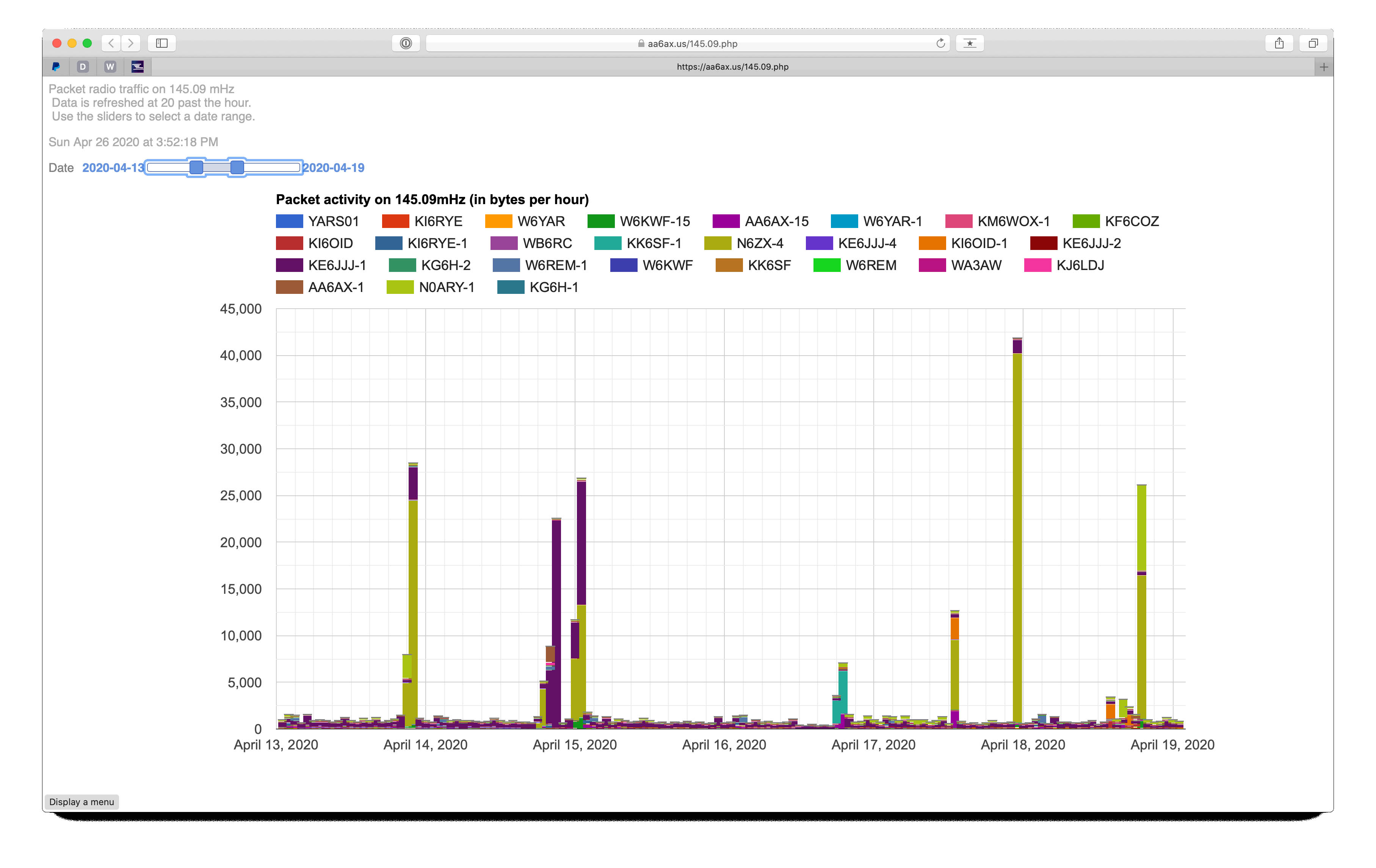
- Very techie here… For a few months I’ve been operating a packet radio station on a 2-meter radio frequency here in the San Francisco Bay Area. I explored what it would take to make this a full “BBS” (like an online “forum”), and then backed off and let it just hang around on this frequency listening to the other (mostly BBS) stations. A few days ago, I got interested in graphing the data to better understand what stations were using the frequency and when.
Packet radio was very popular 20 to 30 years ago, and has mostly been displaced by other amateur radio digital technology and by the Internet. Yet, it’s still quite reliable and is a good way to pass messages from one place to another when Internet or voice communications are unavailable (i.e. in an emergency). I’ve always been interested in the presentation of data, and it was an interesting challenge to figure out how to chart the data in ways that support inquiry.The result of my experimentation is visible in a chart.
The chart is made by this process:
- JNOS (the software that runs the packet radio station) logs all data it hears on the radio;
- A Python script analyzes this log file, keeping track of what stations were heard in each hour;
- The Python creates javascript data in a form acceptable to Google Charts;
- The javascript is transferred to a web server;
- PHP code reads the javascript and inserts it in an HTML page;
- Google Charts javascript fashions the data into the interactive chart.
A “cron” job carries out this process once each hour to keep the chart data current. Because each data bucket spans a whole hour, there’s no need to update more than once an hour.
The post Visualizing packet traffic appeared first on Sky's Blog.


